WHAT WOULD MIRANDA APPROVE?
Kellye McGrew
Creative Direction Study
This project reimagines The Devil Wears Prada Merchandise as a high-fashion editorial capsule, shifting away from literal, quote driven graphics toward a system rooted in symbolism, restraint, and the cultural language of fashion.

THE PROBLEM
The original merchandise relied on literal quotes, generic typography, and standard apparel formats, positioning it as novelty rather than a fashion-driven extension of the brand.
As a result, it lacked the visual sophistication and cultural alignment expected from a film rooted in the fashion industry.
KEY INSIGHT
In fashion, you do't say the reference, you become it.
Luxury and editorial design rely on subtlety, symbolism, and recognition. The overuse of literal quotes disconnects the work from the world it's meant to represent.

CREATIVE DIRECTION
This project blends three core directions:
High Fashion Editorial
Inspired by magazine layouts and campaign visuals.
Modern Minimalism
Focused on restraint, spacing, and intentional design.
Cultural Commentary
Reflecting themes of influence, hierarchy, and access.
PRODUCT CONCEPTS
*AI-generated products were used throughout this project to rapidly prototype and visualize art direction concepts.

A luxury knit that captures one of the film's most iconic monologues into a single word: Cerulean.
Rather than quoting the scene, the design relies on recognition, transforming a narrative moment into a wearable concept.
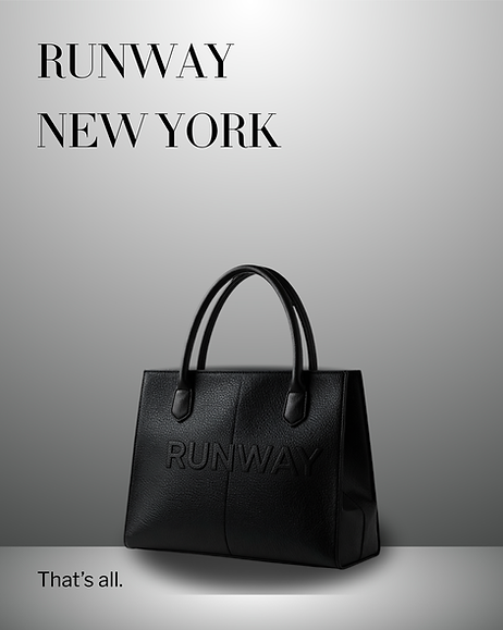
A structured tote designed as an object that could exist within the Runway Magazine ecosystem, defined by minimal typography and strong form.

A curated set of objects inspired by assistant culture, including:
- Cerulean Notebook
- Miranda Pen
- Editor Sunglasses
- "Urgent" Sticky Notepad
- Stiletto Enamel Pin
Collectible elements, reframing merchandise as a premium, narrative-driven artifact.

A refined reinterpretation of the film's iconic stiletto motif, transforming it into a central symbol of the collection.

A campaign visual that captures the tone of the Runway world, controlled, composed, and authoritative.

ART DIRECTION
The visual execution draws from fashion editorial standards, using dramatic lighting, minimal composition, and strategic negative space to create a campaign-driven presentation.
Each frame you see is designed to feel like a magazine spread rather than a traditional social media layout.
OUTCOME
By shifting from merchandise to fashion system, the project demonstrates how design thinking can elevate a concept from novelty to a narrative-driven experience.
Good design doesn't explain itself.
It understands the assignment.